EN
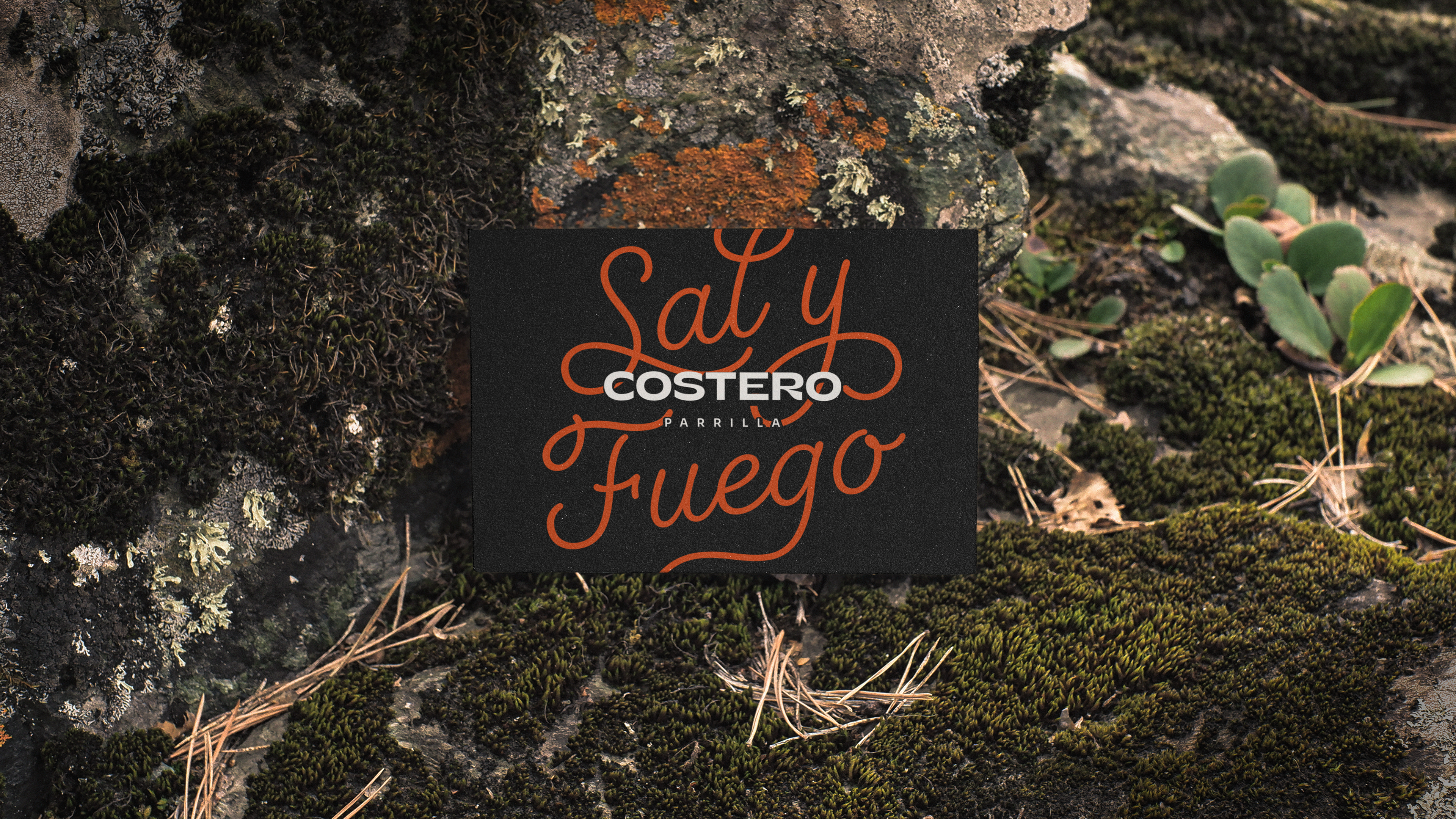
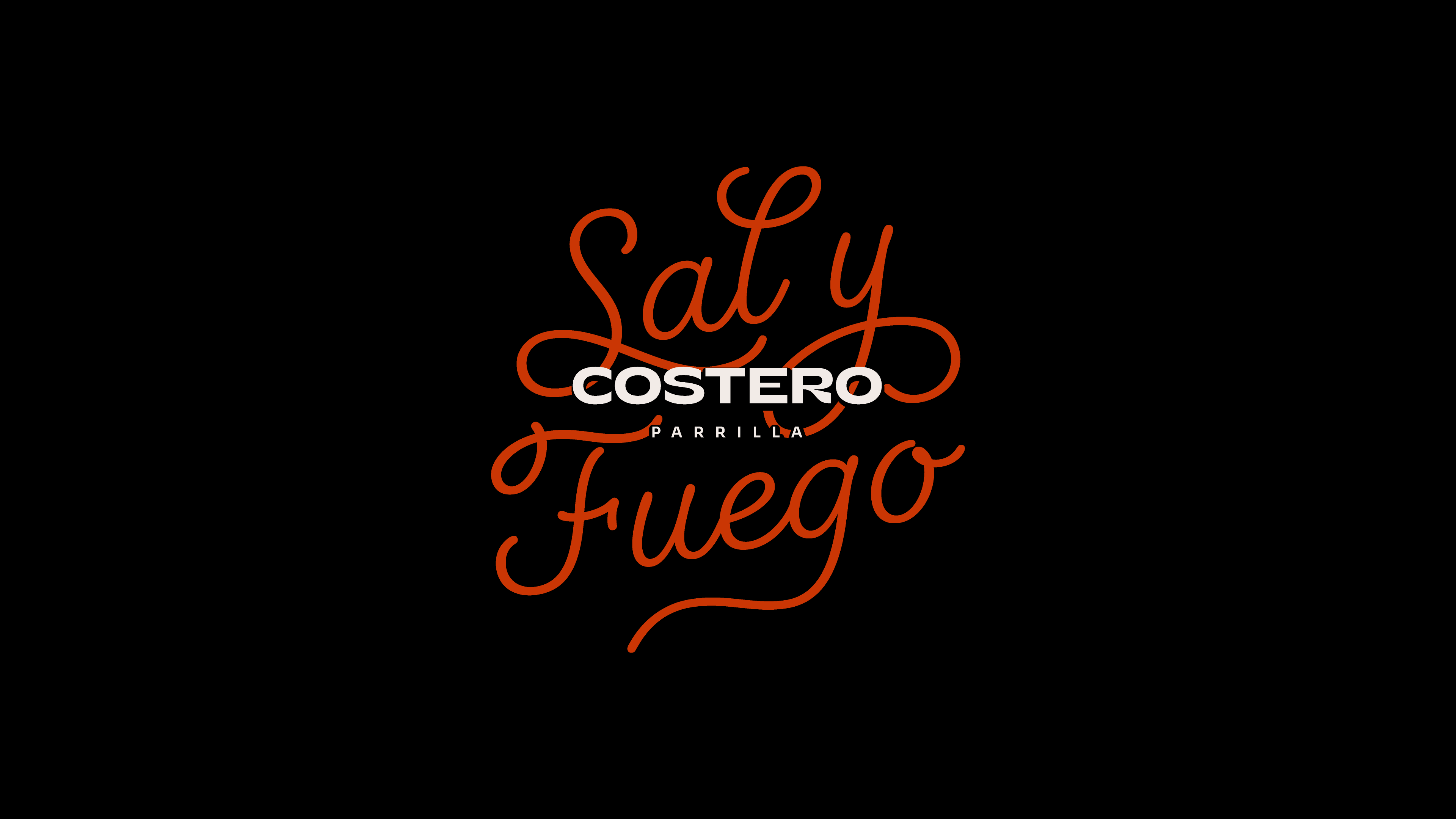
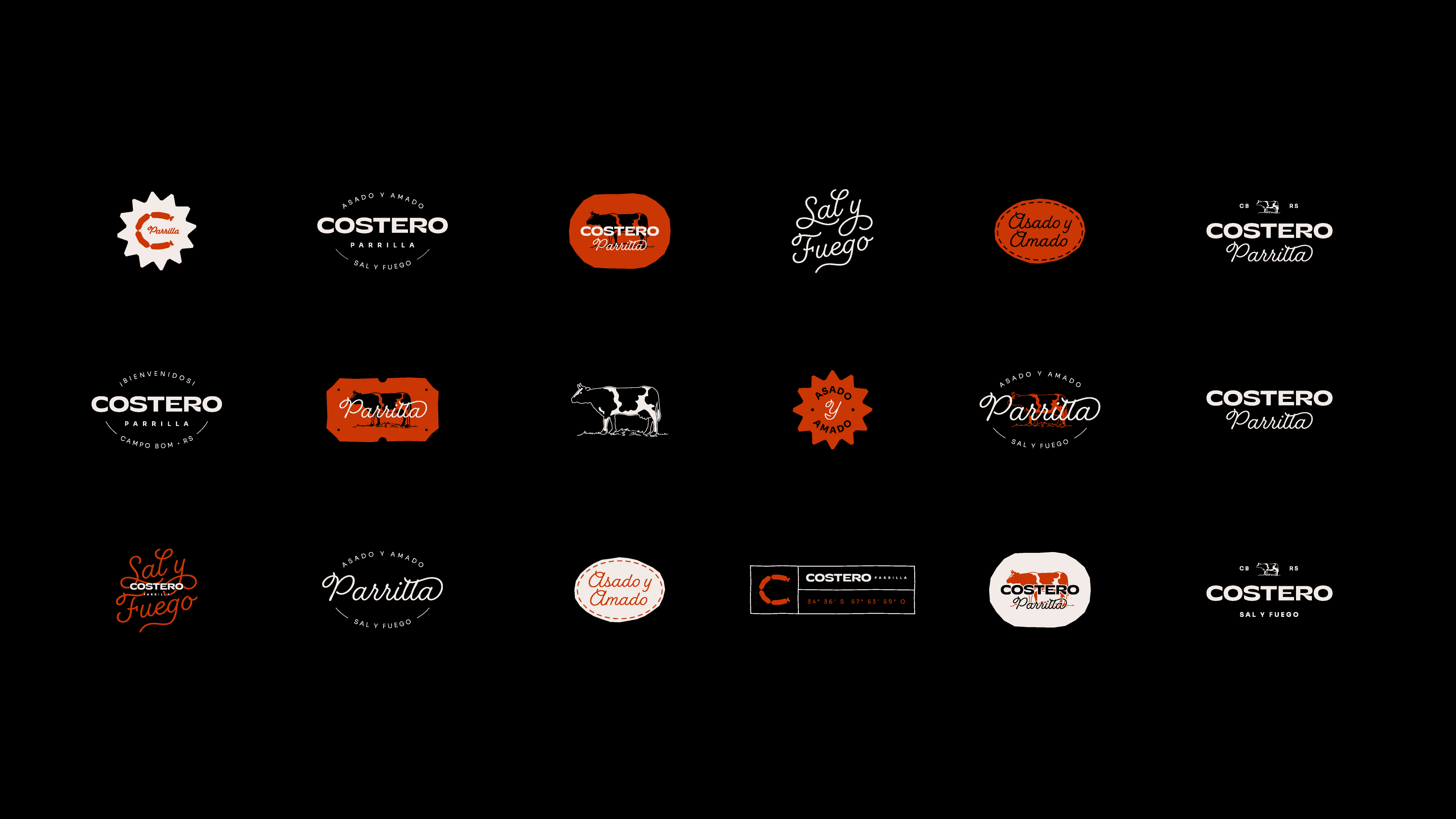
Costero Parrilla was born from the challenge of integrating into the Costero complex ecosystem while maintaining a distinct personality that honors the tradition of rustic cuisine. The brand is a tribute to the "gaúchos", the brave and free-spirited natives of the vast Pampa region spanning Southern Brazil, Argentina, and Uruguay. It is within this shared culture, where barbecue is not just a dish but an ancestral ritual, that the visual identity finds its foundation.
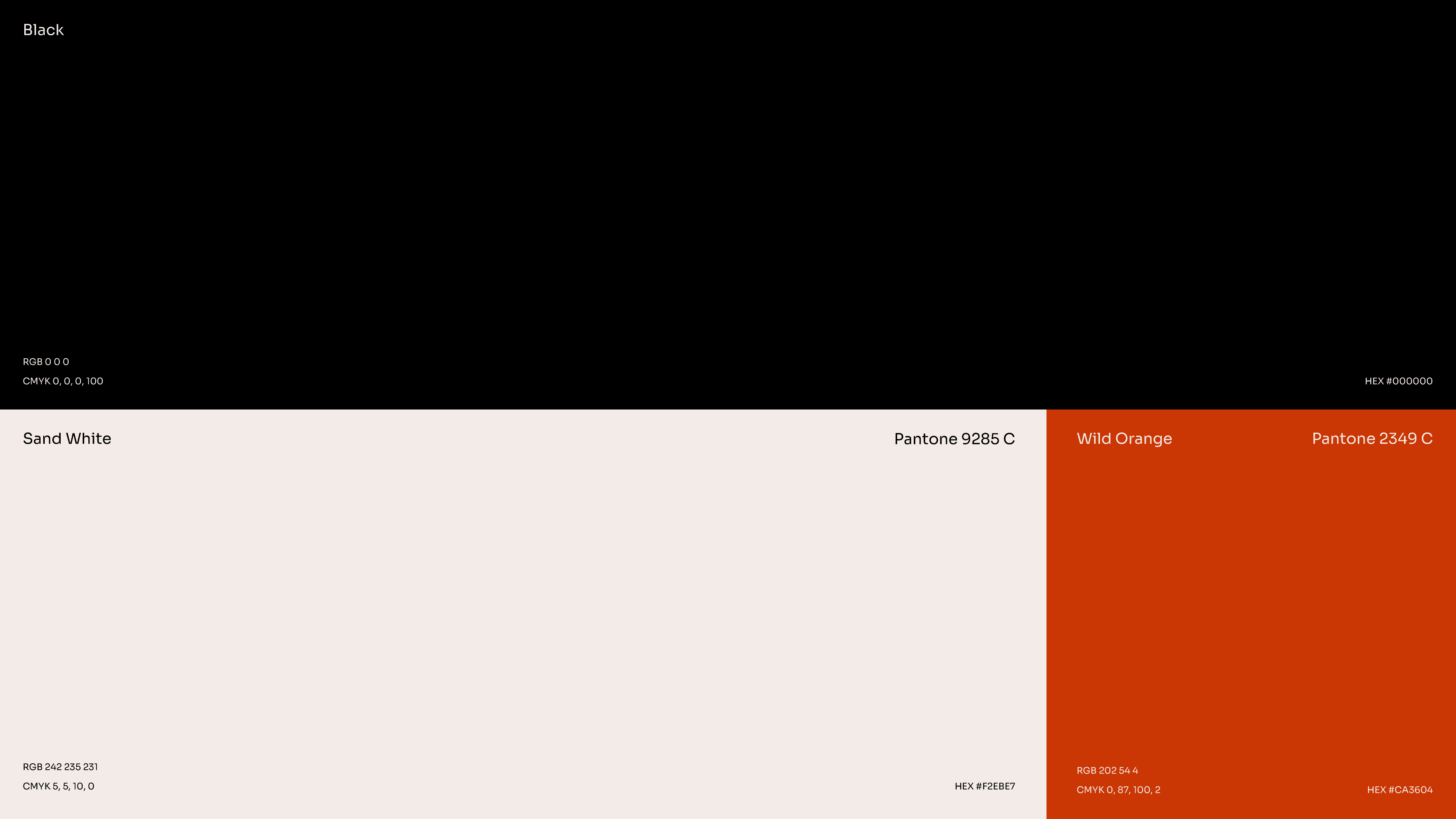
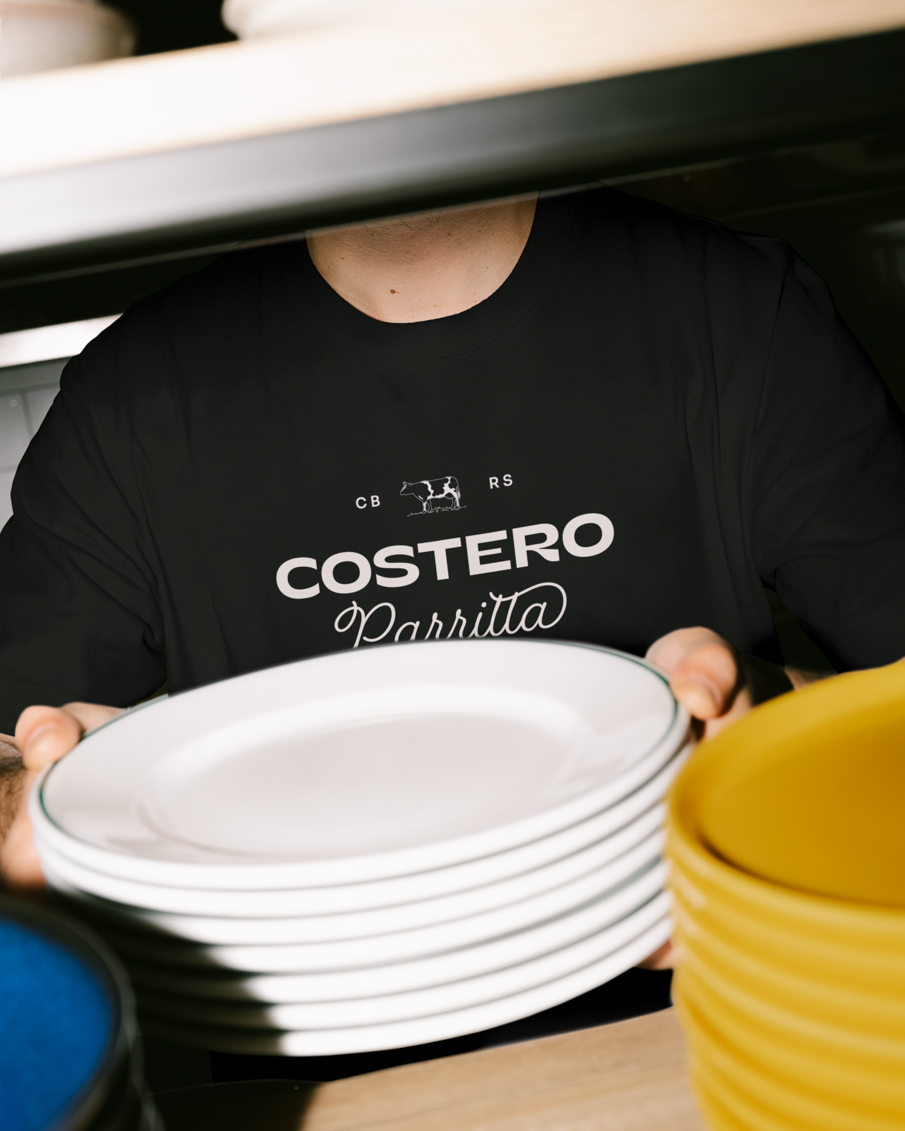
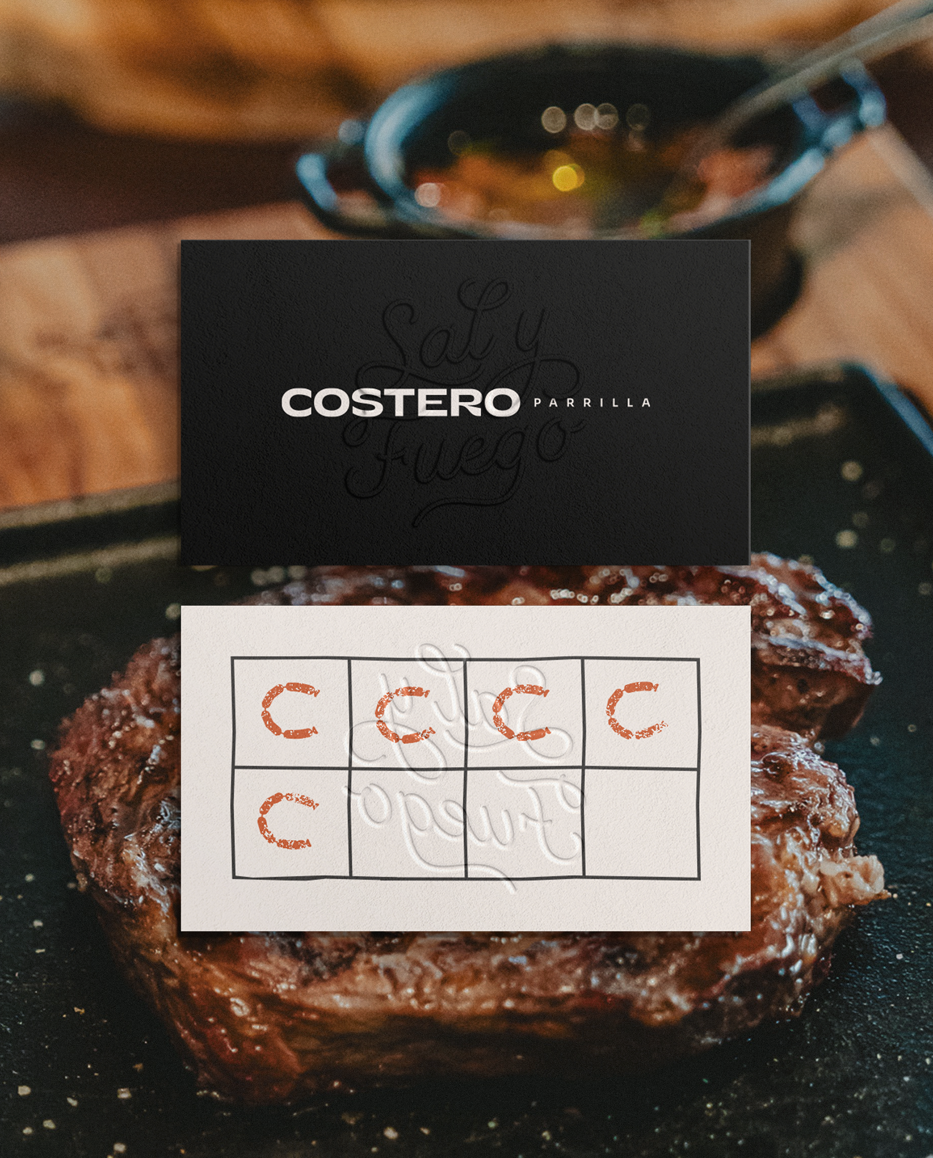
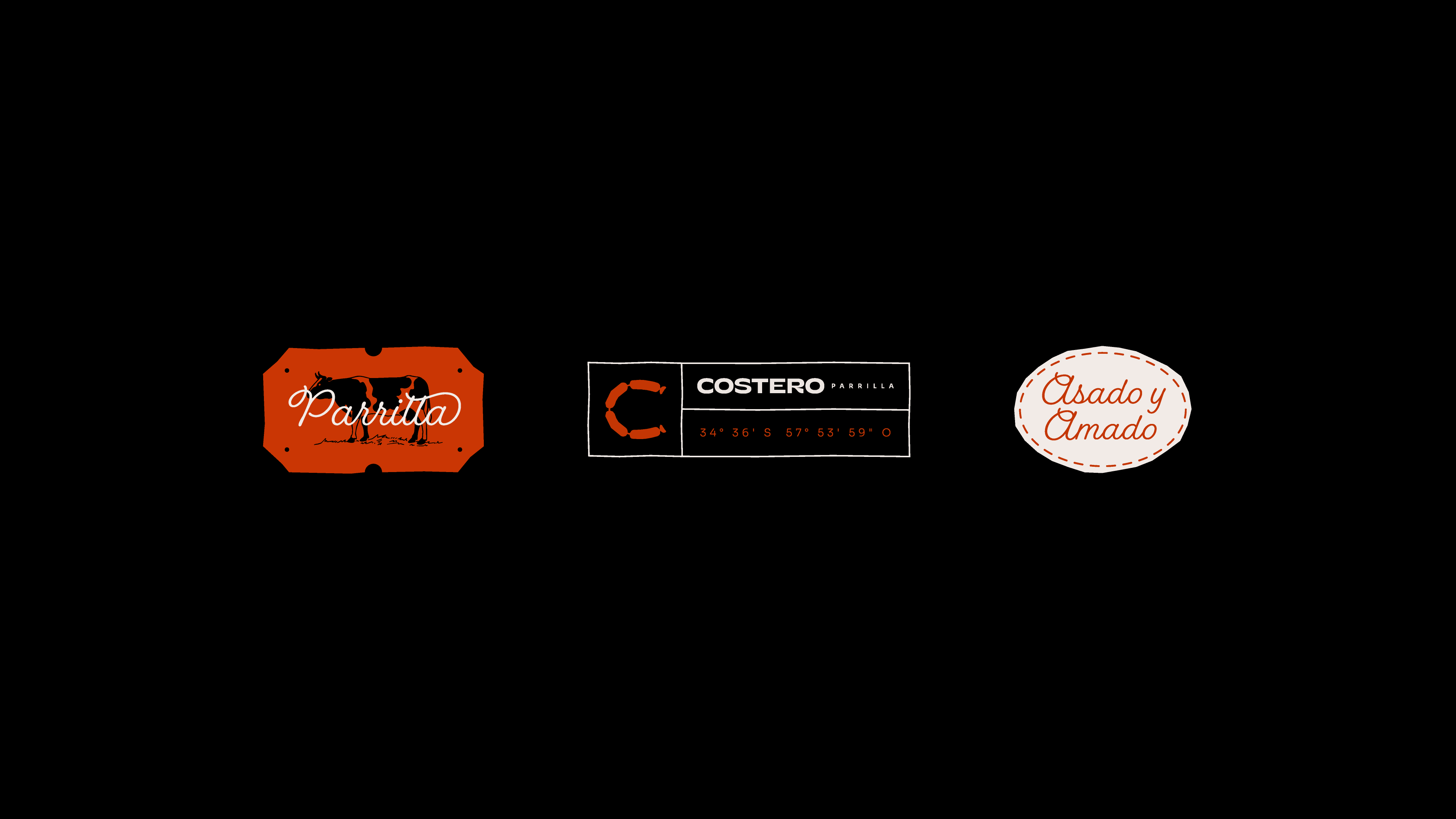
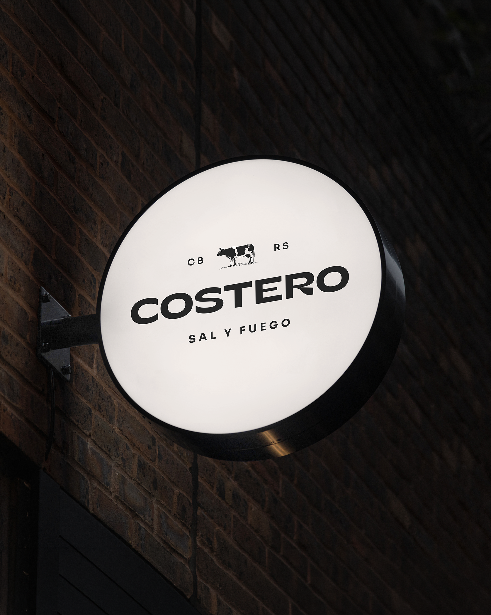
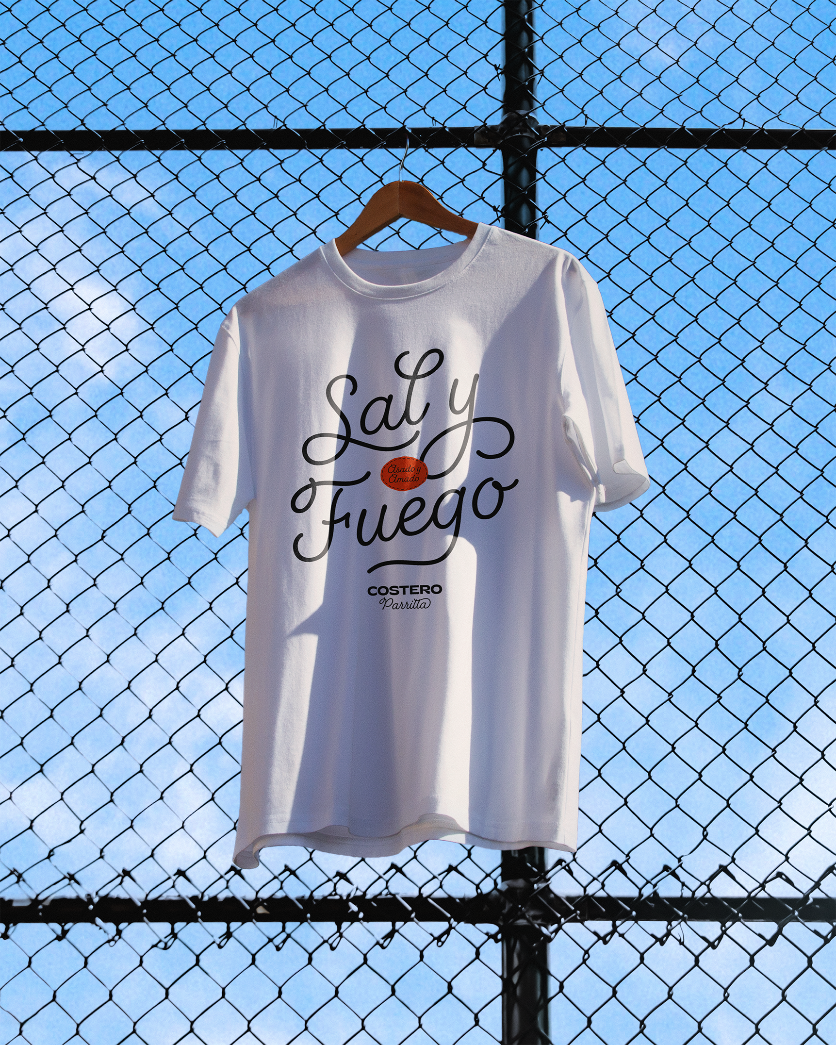
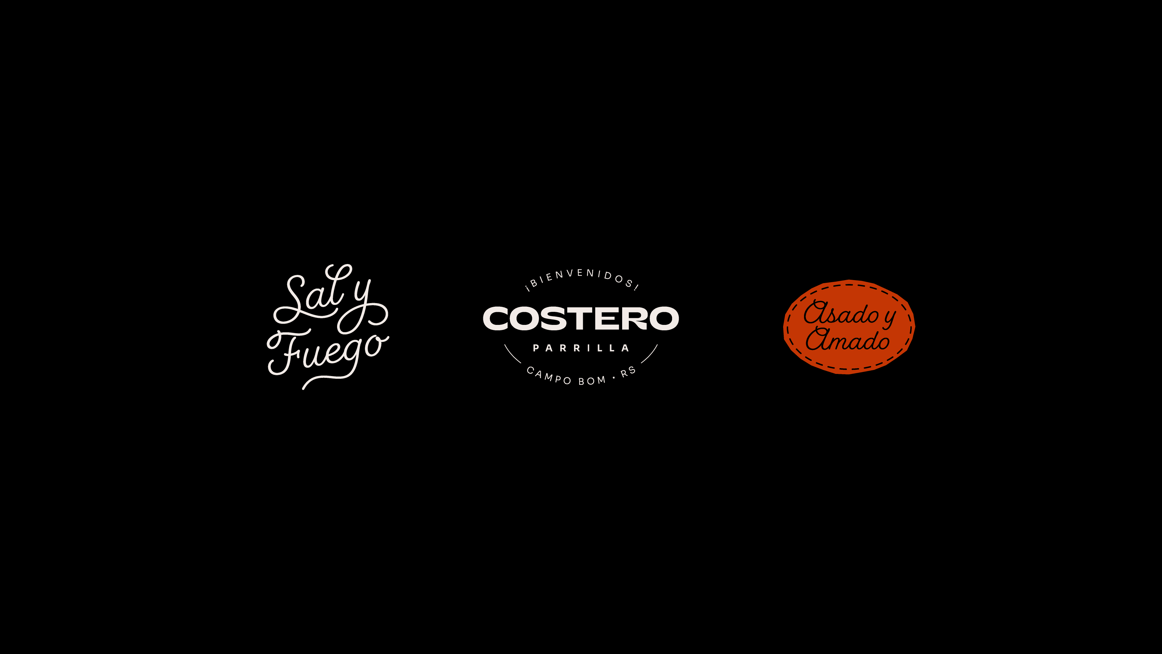
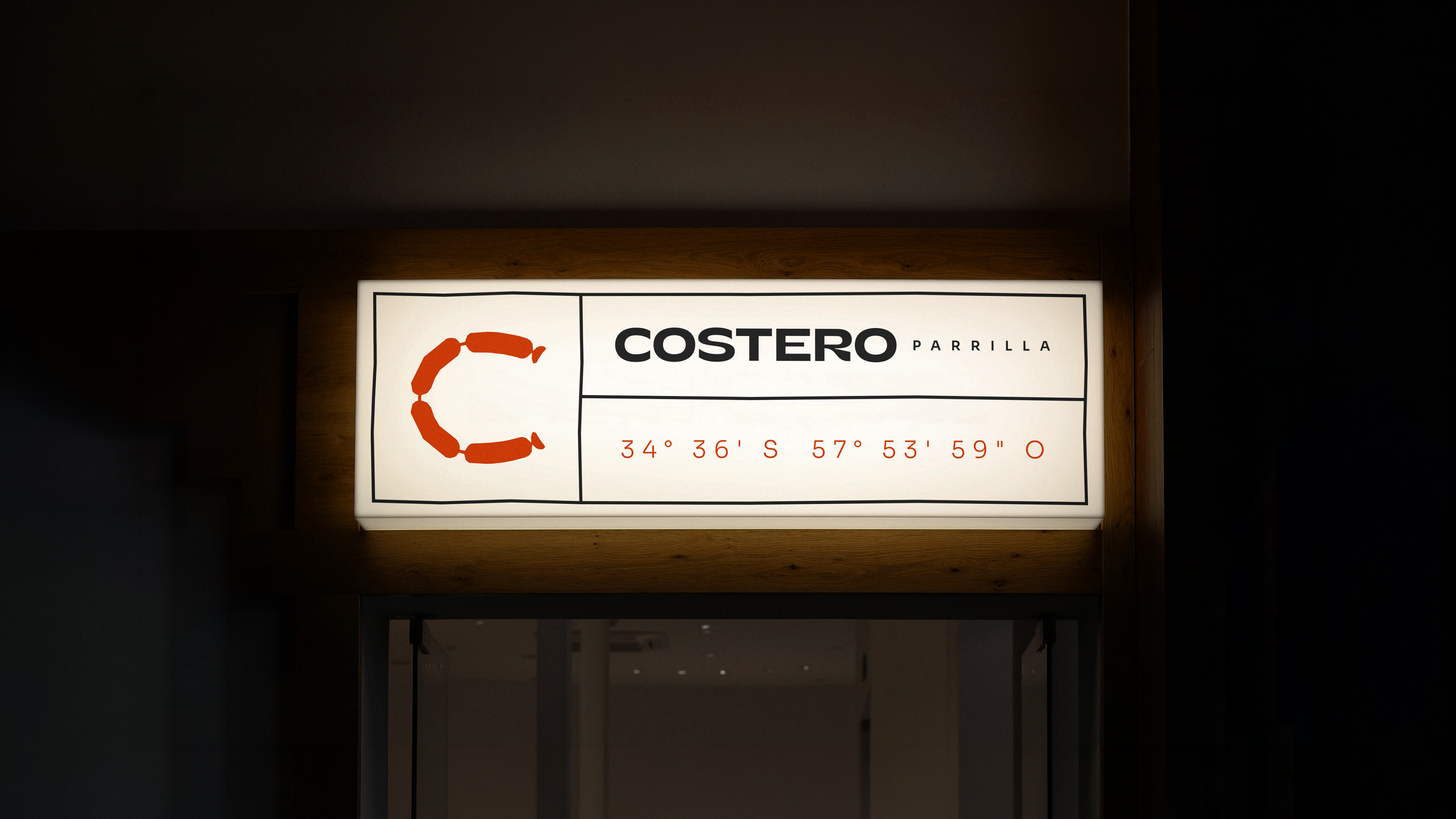
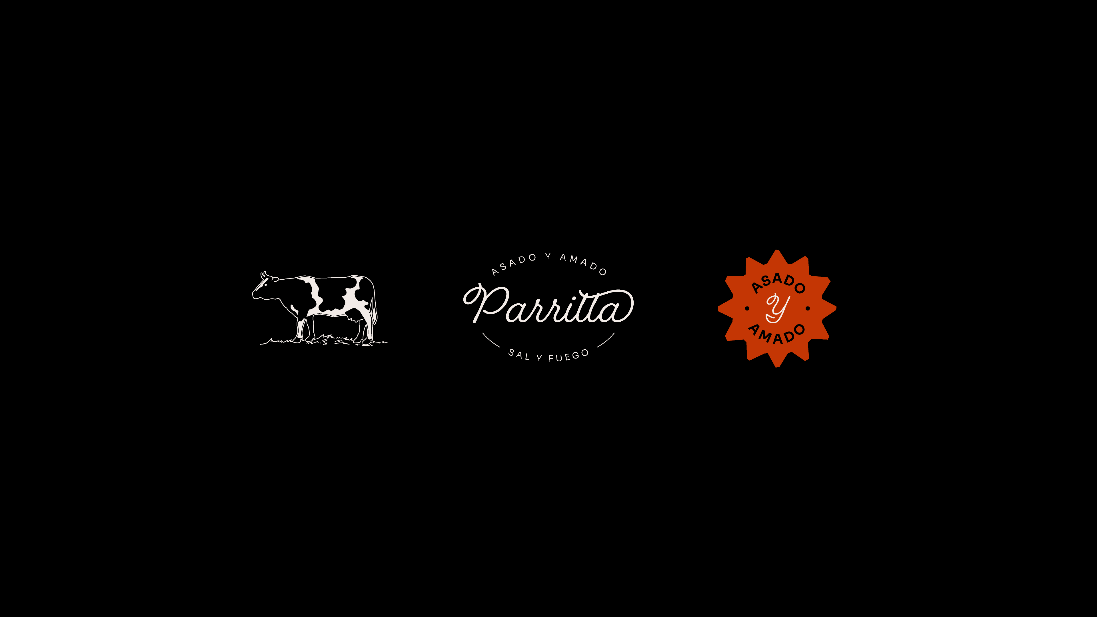
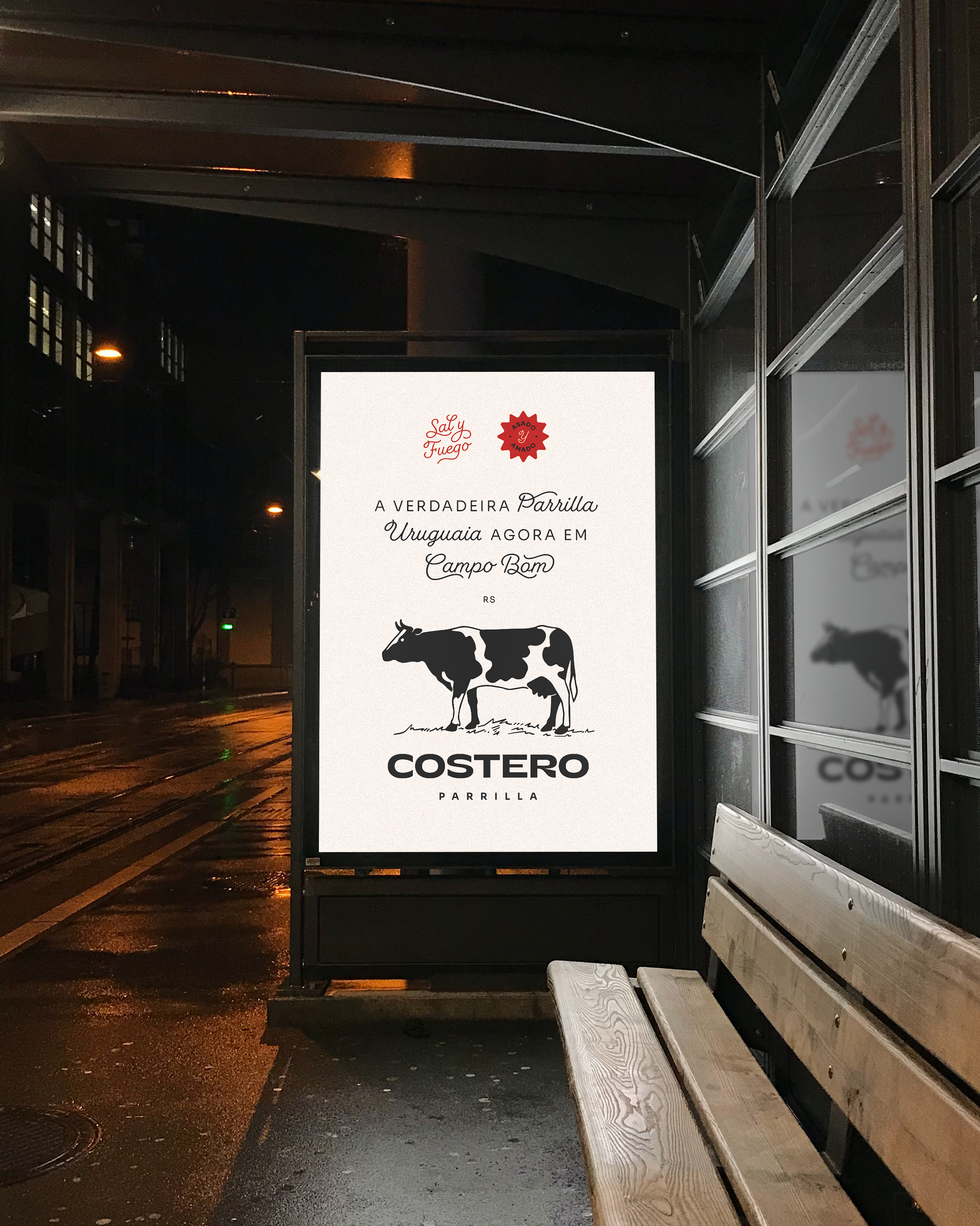
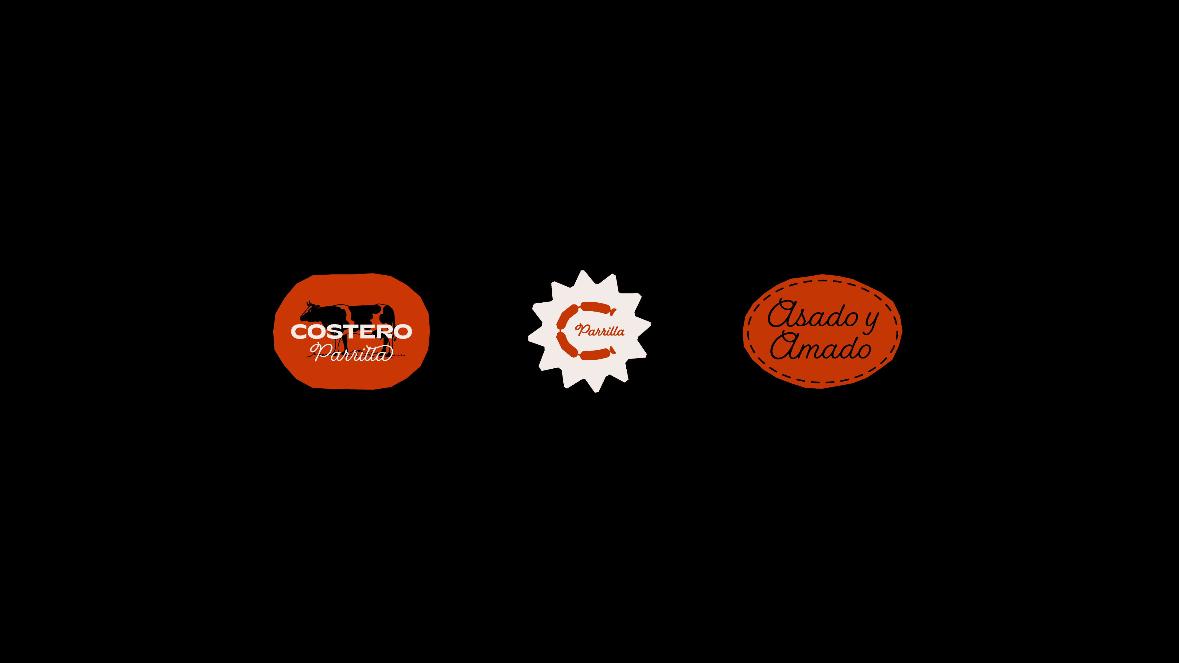
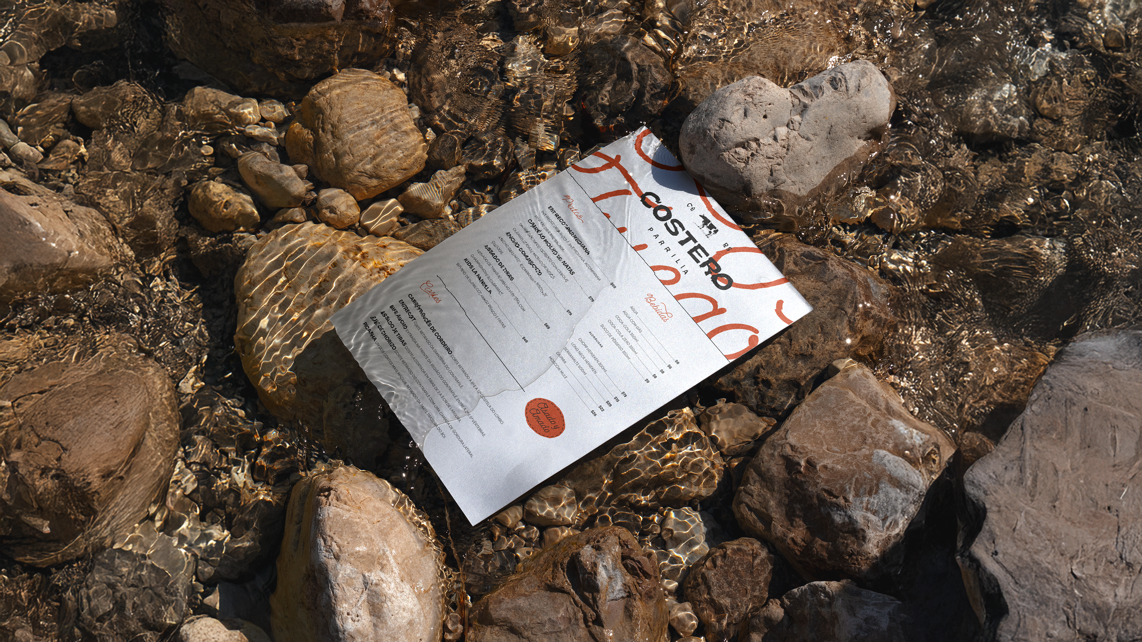
The visual solution balances the parent brand’s DNA with exclusive elements that evoke the world of the parrilla. The logo retains the complex’s typography, now accompanied by the word "parrilla" to define its territory. The color palette preserves the original Sand White but introduces Wild Orange, bringing the heat of the embers and the energy of fire to the identity, while the predominant Black ensures the sophistication demanded by its audience.
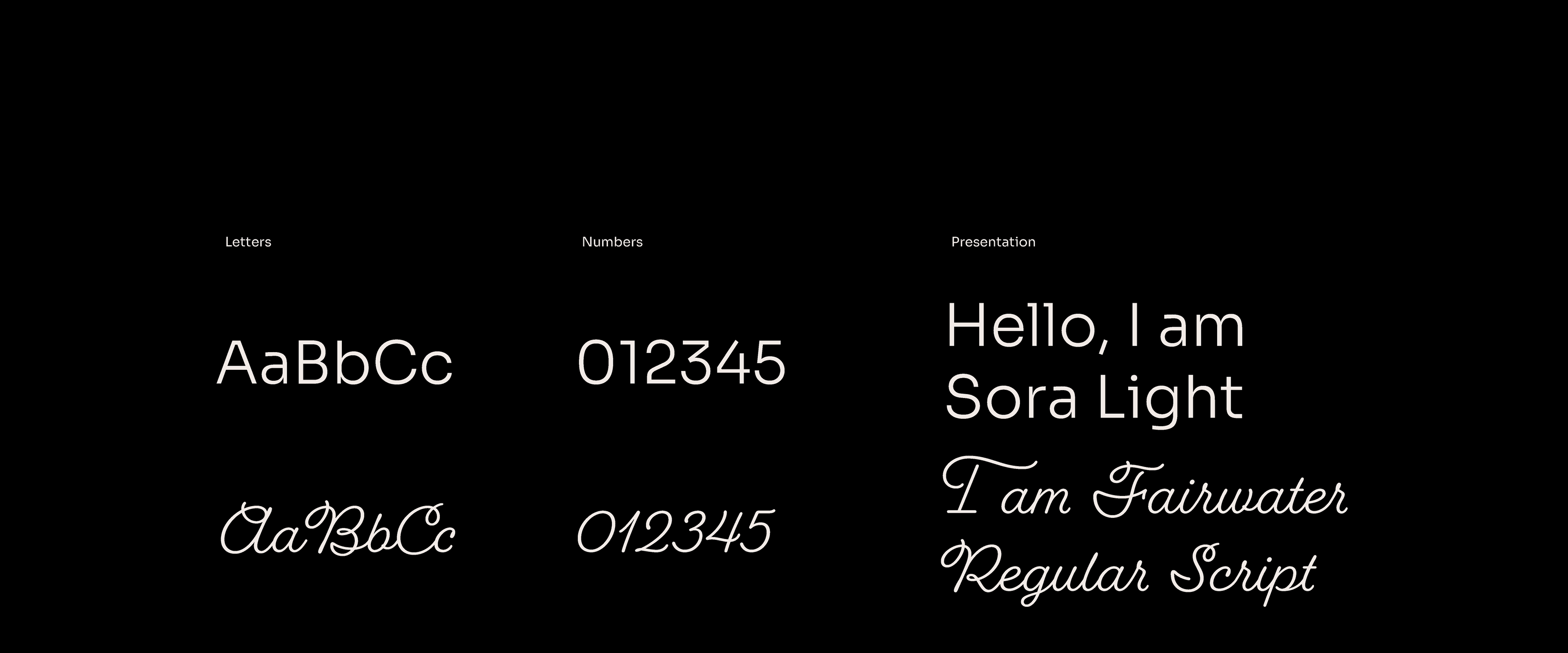
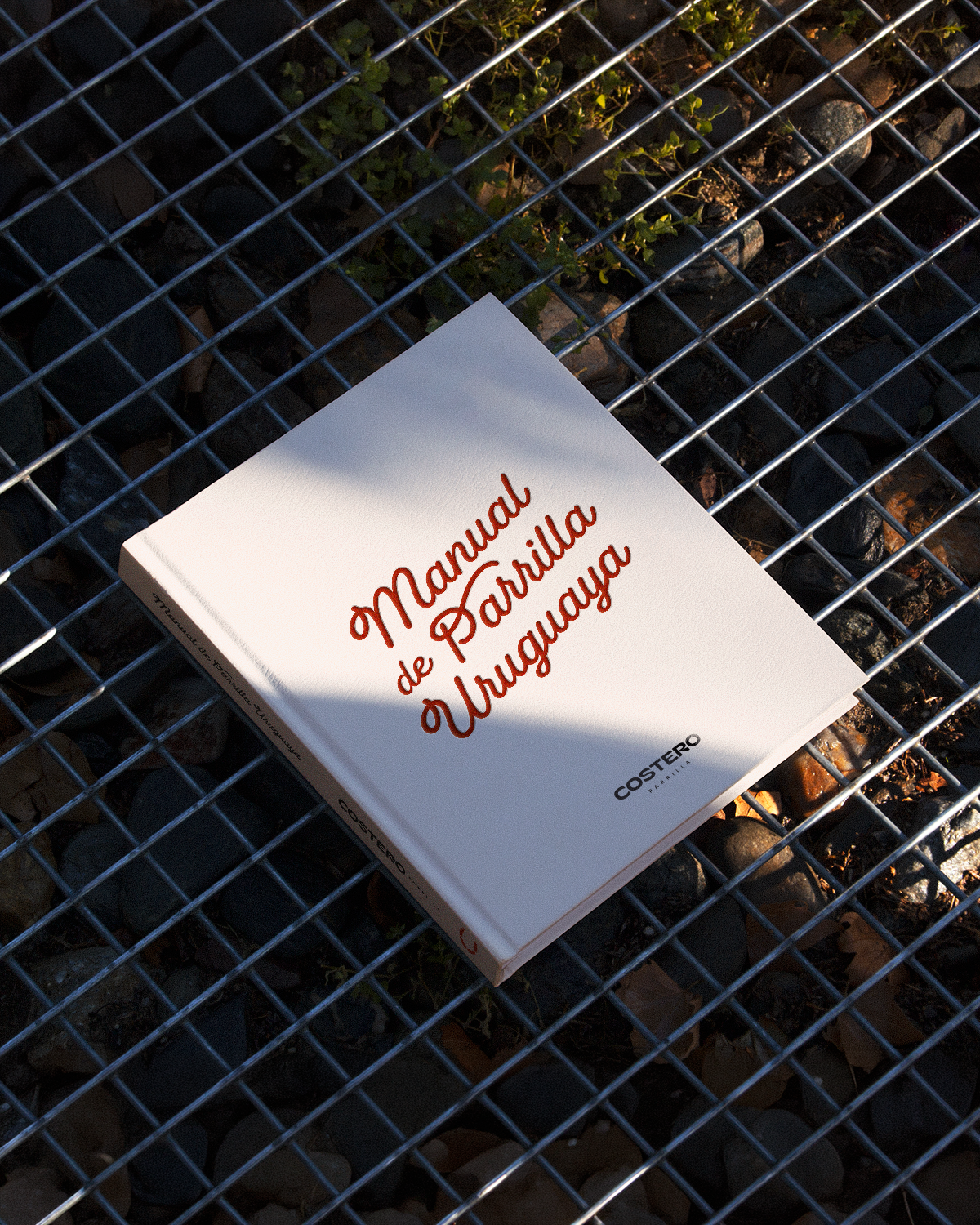
To reinforce the artisanal and native character, the Sora typography takes on a lighter, more elegant weight, contrasting with Fairwater Script, a cursive font that evokes a handcrafted feel and countryside rusticity. The result is an identity that oscillates between the raw and the sophisticated, celebrating the roots of the Pampa through a contemporary and unique visual language.
PT
O Costero Parrilla nasce com o desafio de integrar o ecossistema do complexo Costero, mantendo uma personalidade própria que honre a tradição da culinária rústica. A marca é uma homenagem aos "gaúchos", os nativos bravos e livres que habitavam a vasta região dos pampas entre o Rio Grande do Sul, Argentina e Uruguai. É nessa cultura compartilhada, onde o churrasco não é apenas um prato, mas um ritual de origem, que a identidade visual encontra seu fundamento.
A solução visual equilibra o DNA da marca-mãe com elementos exclusivos que evocam o universo da parrilla. O logotipo mantém a tipografia do complexo, agora acompanhado pela palavra "parrilla" para delimitar seu território. A paleta de cores preserva o Branco Areia original, mas introduz o Laranja Selvagem, que traz o calor da brasa e a energia do fogo para a identidade, enquanto o Preto predominante garante a sofisticação exigida pelo seu público.
Para reforçar o caráter artesanal e nativo, a tipografia Sora ganha um peso mais leve e elegante, contrastando com a Fairwater Script, uma fonte cursiva que remete ao feito à mão e à rusticidade campeira. O resultado é uma identidade que transita entre o bruto e o sofisticado, celebrando as raízes do pampa com uma linguagem visual contemporânea e única.
Client: Costero Parrilla | Service: Visual Identity | Year: 2023